- Simplify Your Message
- Posts
- You're Posting Wrong (And Your Engagement Proves It)
You're Posting Wrong (And Your Engagement Proves It)
Stop writing captions like you're Shakespeare.
Redona Dida
July 16, 2025
The Social Media Lab is officially open! 🔥 I'm personally selecting members one by one to keep the vibe right—think quality over quantity. This stays completely free until we hit 200 members, then we're closing the doors. Ready to ditch the burnout and actually enjoy creating content again? Join now before we fill up. 👇 |  Tap to join the group |
Your audience scrolled past your "perfectly crafted" post in 0.25 seconds. They didn't even read your witty hook or your call-to-action.
Here's what actually happened: your brain processed that sunset photo 60,000 times faster than your caption.
Why Your Text Posts Are Invisible
Your brain is wired for images, not sentences. It's not personal—it's biology.
While you're debating whether to use 3 or 5 hashtags, your competition is creating content that actually gets seen:
Posts with images get 94% more views Infographics get shared 3x more than text posts 43% of your followers want more video content Visual posts get 2.3x more engagement
Your beautifully written caption? It's fighting a losing battle.
What Actually Stops the Scroll
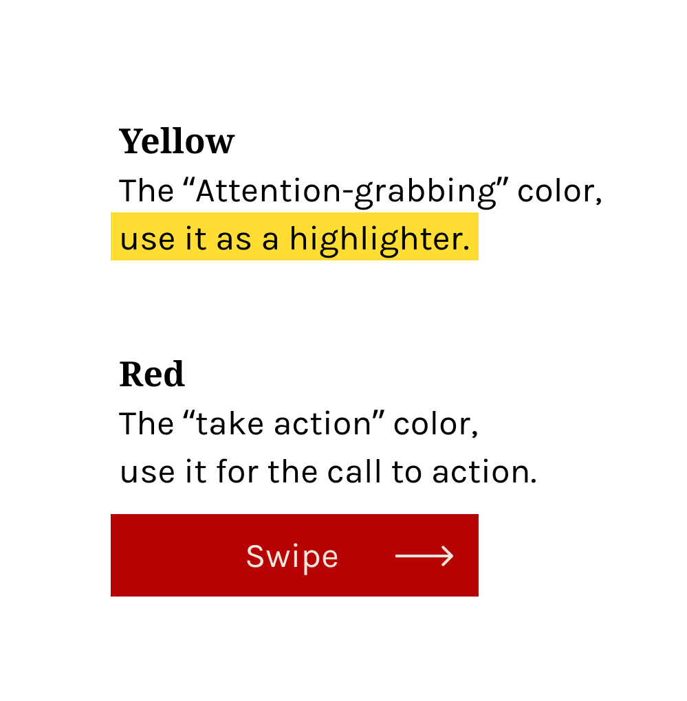
Colors are your secret weapon
Yellow grabs attention faster than any other color. It's why highlighters are yellow. It's why smart creators use yellow strategically.
Red creates urgency. That red "swipe up" button? Your brain wants to tap it before you've even read it.
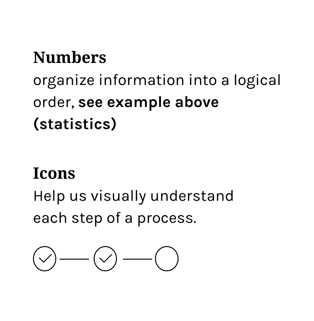
Numbers make everything clearer
Your brain loves patterns. "98%" beats "some helpful advice" every time.
Step-by-step visuals? They're processed instantly.
Long paragraphs? They're work.
Clean fonts win followers
Fancy fonts kill engagement. Your audience won't struggle to read your content.
Use these instead:
Helvetica Now
Proxima Nova
Futura
Public Sans
Jam Grotesque
Clean = readable = shareable.
The Rule That Changes Everything
Keep it stupidly simple.
Complexity kills engagement. Your audience is overwhelmed, not stupid.
One message per post. One action per story. One takeaway per carousel.
Simple wins. Always.
Stop asking "What should I write about?"
Start asking "How can I show this instead?"
Every post should be visual first. Your caption should support your image, not compete with it.
This shift will transform your reach, your engagement, and your follower growth.
Free Tools for Better Visuals
Pexels - Free stock photos that don't scream "stock photo"
Canva - Templates that make you look like a designer
Unsplash - High-quality images for every niche
Pixabay - Photos, graphics, and videos
Burst - Shopify's free image library
Kaboompics - Lifestyle photos that feel authentic
Lifeofpix - Artist photos with no strings attached
Gratisography - Quirky images that stand out
Createherstock - Diverse, inclusive photography
New Old Stock - Vintage vibes from public archives
You're not competing with other posts in your niche.
You're competing with cat videos, breaking news, and that friend's vacation photos.
Your text-heavy post about productivity tips? It's losing to a 15-second dance video.
That's not your audience being shallow. That's your audience being human.
What Winners Do Differently
They create content that works with human psychology, not against it.
They use visuals to stop the scroll, then deliver value that keeps people coming back.
They know that being seen is the first step to being heard.
Your move.
See you next Wednesday
Redona
Founder of Simplify Your Message
Click the bonus insight you want to receive 👇 |